
Tuesday, 30 March 2010

Wednesday, 24 March 2010

Four Page Digipak progress

The image at the bottom right is the front cover image.
The bottom left image is the back on the CD digipak and the top left is the right hand side image inside the case of the digipak. (behind where the CD is placed)
Tuesday, 16 March 2010


Thursday, 11 March 2010
drum and bass album research 2

This is a typical Drum & Bass album cover which features complicated designs linked to the music.
Symbols of music can be seen through the sound icon and the speaker cones all over the cover. running along the bottom is also a sound wave design.
It continues the themes of space age, sci-fi and futuristic as shown in drum and bass videos. this can be seen through the cityscape in the background and the robot like speaker stack in the foreground.
drum and bass album research

Bright style with simple fonts.
Only a few colours used but a fairly elaborate design in the background.
Wednesday, 3 March 2010
Thursday, 25 February 2010
The Vines Album Magazine Advertisement

This is an advert for The Best of The Vines album.
the Advert doesn't actually feature an image of the album cover but instead uses the design from the cover as an enlarged image for the whole advert.
The colour scheme is simple as it only has three colours of green, black and white.
The text on the advert is slanted which fits with the rest of the advert because the image is at a similar angle.
The image on it looks hand drawn which matches the image the band try and portray. It is a rock band and this can clearly be seen through the style of the advert.
The advert shows the reader the hit songs and advertises bonus tracks which makes the reader want to buy it.
Wednesday, 24 February 2010
Greenday album magazine advert

This is an advert for Greenday's 'American Idiot'
This is very simplistic as it only uses three colours, red, black and white.
The image itself is very simple and doesn't give that much information about the album. This means that Greenday were relying on their name being enough to get the album sold.
The information given is the name of the band and the title song of the album. The name of the band is in a white font and in capital letters which makes it stand out more than the song name which is in red and in lower case. This further confirms that the band rely on their name to sell the album.
There is a small logo in the corner which represents the production company that produced the album.
Gwen Stefani album magazine advert

This is a magazine advert for an album by Gwen Stefani.
All the colours on the advert are bright and bold which mirrors the style of pop music the artist performs.
A image of the album is clearly shown at the bottom left of the advert and the advert itself is an enlarged image from the album cover.
The advert has the names of the hit songs on the album across the bottom and shows Gwen Stefani's website address.
The album advert also states that the album is 'in stores now' This tells the audience that it has already been released and they can purchase it.
The font predominantly shown is elaborate and gold which further mirrors the genre of pop music the album contains.
The main image in the advert is merged and blurred in the background which gives the reader a sense of hallucination; this relates to a music video which parodies Alice in Wonderland.
The whole album cover and advert is related to another song on the album called 'rich girl' this can be seen through the gold imagery and the fact that she is sitting on a throne holding a crown.
The advert also lists the names of the production crew behind the album.
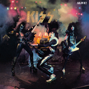
ALIVE!
This album cover is taken from a live album by Kiss called 'ALIVE!'
The characters in my music video will parody the band members of Kiss.
This album is a live album which means that all the songs on it are from a live performance:
1.Deuce
2.Strutter
3.Hotter Than Hell
4.Firehouse
5.Nothin' to Lose
6.C'mon and Love Me
7.Parasite
8.She
9.Watchin' You
10.100,000 years
11.Black Diamond
12.Cold Gin
13.Rock and Roll All Nite
14.Let Me Go, Rock 'n' Roll
This album depicts the band playing live becuase it is a live album. the colours seen in the cover are typical of a glam rock band with silver, black and red being the most promonent colours.
The background of the cover is mostly smoke but does not seem to be part of the photograph. The background of the image seems to be added afterwards to give the effect that they are playing live when the picture was taken.
The cover has a dark theme which fits with the band's image as they are a rock band. The title of the album is shown to be less important than the band's name because it is in a smaller font. However, the title of the album is in a more promonent colour and is in capital letters whcih makes it noticable to the consumer.
Althought he name of the band is large above their heads and is in bright lights, it fades into the background because of the smoke that surrounds it. I believe this may have been done to make it look more like the band was playing live at the time of the photograph.
Thursday, 4 February 2010
Dark side of the moon

This is another famous album I will consider doing a parody of for my project. Its called Dark side of the Moon. The album cover is very simplistic and only contains an image of light going through a prism. This album was a concept album; this means that all the songs on the album were based around a central theme.
track list:
Speak to Me
Breathe
On the Run
Time
Money
Us and Them
Any Colour You Like
Brain Damage
Eclipse
The tracklist does not seem to relate to the picture on the front of the cover but the cover is still one of the most famous covers ever.
Abbey Road

· Picture of the band outside the famous studio : Abbey Road
· Shows that its from 1960s/70s through the cars lined up on the street behind the band.
· The band aren’t wearing the same thing, they are wearing deliberately different clothes. One of them has no shoes and is holding a ciggerette; this also shows the time period as it was more socially acceptable to smoke.
· The album cover deliberately has no writing on because the band were already famous enough for people to recognise them in the picture.
· This album cover would be an obvious choice to parody in the creation as it is the most imitated album cover ever.
Track list:
Come Together
Something
Maxwell's Silver Hammer
Oh! Darling
Octopus's Garden
I Want You (She's So Heavy)
Here Comes the Sun
Because
The Medley
Her Majesty
Thursday, 28 January 2010
Aims Statement
The three products that I am doing for my coursework are:
· Music promo video: This will be a music video for a song with a storyline and will employ fast cutting to match the drum and bass style of music
· Album Cover: The album cover will be a cover for the song shown in the music video and will mirror other album covers typical to the genre of drum and bass. To create this I will use Photoshop and my research to understand what a conventional drum and bass album looks like.
· Magazine advertisement: The magazine advertisement will advertise the album which I created the cover for and will feature the models from the music video. To create this I will use Photoshop.
The target audience for all my products will be teenagers from 14 to 19 because the style of music appeals to that age group.
Synergy is used through the advertisement of the album because it will feature models from the music video and this will promote the music video as well as the album.
The institution most likely to have the power to make these three products would be Sony Corporation because they own advertising companies and Sony BMG which is a music entertainment company that owns many record labels. This would allow them to use all of their resources to create all products and not have to pay someone else to create the three products.
Weekly update
This week I have decided that all of my pieces of coursework will relate to post-modern media in some way.
EXAMPLES!!
EXAMPLES!!
Thursday, 14 January 2010
Examples of music videos
Standard BPM of all drum and bass songs is 180bpm
The video shows fast cuts, fade o blacks, cut to blacks and dissolve.
Main features of any music video is that the cuts are made on the beat.
Strange editing styles, reversing and splitting into different sections used.
Strange fantasy like theme to the video.
http://www.youtube.com/watch?v=j6JhI4fVxPQ
Pendulum: Granite
Again fast cutting used on the beat and there is a fantasy theme to the video.
Brief For Advanced Portfolio
Brief
A promotion package for the release of an album, to include a music promo video, together with two of the following three options:
- Website homepage for the band
- A cover for the release as part of a digipak (CD/DVD package)
- A magazine advertisement for the digipak (CD/DVD package)
I have chosen to do the cover for the release as part of a digipak and the magazine advertisement for the digipak.
Wednesday, 13 January 2010
Analysis of skills using digital media
I am more confident using Adobe Photoshop software becuase I have had practice using it in other subjects, however, I need to improve my text editing skills using the software.In Adobe Photoshop I can add/delete backgrounds, add/delete objects, change opacity, layer images, use magnetic lasso tool to cut out objects, insert text, put stroke on text, put afterglow on text, put noise on text, change layer order, copy into new layers, change colour of objects/text/borders/backgrounds, create styles in Photoshop to be used again, lock and unlock layers, blend foreign images in with each other, add gradient, create light and dark patches, create a light source, crop images and use magic wand to select objects.
The software I am least able at using would be Microsoft Publisher as I have had very little practice using it.
I believe I can use a camcorder effectively, but I may need further practice as I haven't used the equipment for a long period of time; but I can load tapes, in camera edit, zoom in/out, use a tripod, use various settings like black and white/sepia/blue filter.
I am confident using video editing software and all the tools involved in that software; such as cut footage, move footage, change time code, add effects, remove sound and add soundtrack. I also have other skills in using audio editing software such as logic pro which may help me complete my coursework.
I believe that since last year my skills have improved and there are things I would do differently in my coursework. I probably would have used more models becuase my magazine was very limited and would perhaps use new found skills in photoshop to create a more attractive logo and masthead. I also would change the colour schmeme to something less simple because without an effective logo the magazine looked boring.
Subscribe to:
Comments (Atom)